CROSS-INDICATION PATIENT & CAREGIVER RESEARCH
PHARMA WEBSITE NAVIGATION PREFERENCE BENCHMARKING
This research initiative was designed as a cross-indication patient and caregiver navigation preference benchmarking study, representative of general patient and caregiver needs across pharmaceutical websites. Using 400 survey responses and 45 qualitative user sessions, the study evaluated how patients and caregivers navigate complex medical information, access support resources, assess trust, respond to content structure, and engage with pharma website patterns across desktop and mobile experiences.
-
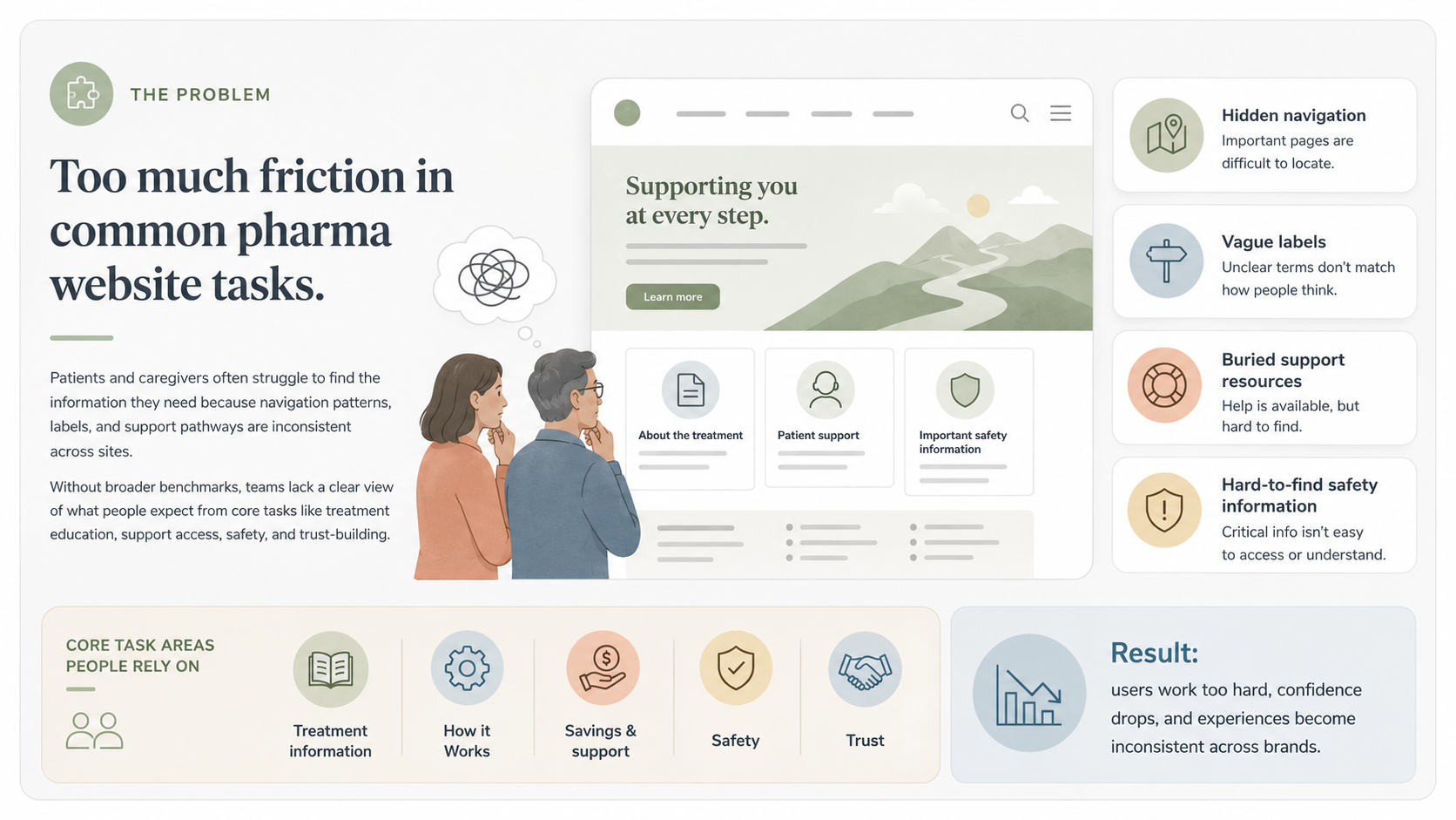
Pharmaceutical websites often make patients and caregivers work too hard to find the information they need, especially when navigation is hidden, labels are vague, support resources are buried, or safety information is difficult to access. Because many studies are conducted within individual brands or indications, organizations often lack broader benchmarks that show how general patient and caregiver audiences expect pharma websites to work across common tasks such as finding treatment information, understanding “How it Works,” accessing savings or support, evaluating safety, and building trust.
-
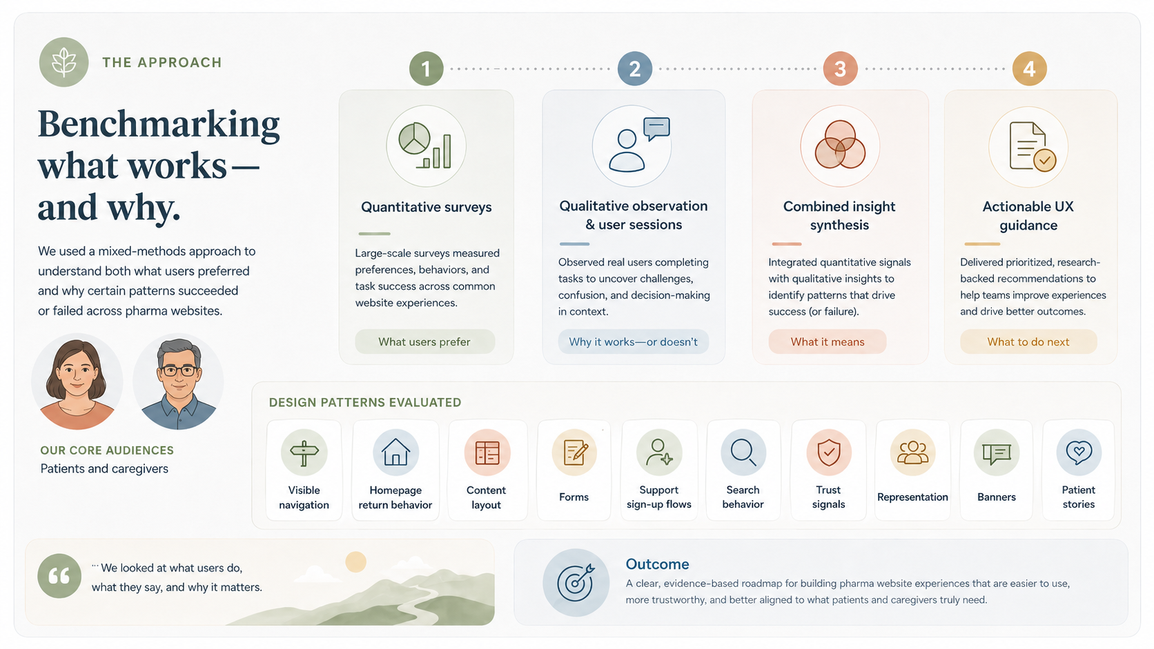
I led a mixed-methods benchmarking approach that combined quantitative survey data with qualitative user observation to identify both what users preferred and why those patterns succeeded or failed. The research evaluated key pharma website design patterns, including visible navigation, homepage return behavior, content layout, forms, support sign-up flows, search behavior, trust signals, representation, banners, and patient stories, across patient and caregiver audiences to uncover shared expectations, behavioral differences, and actionable UX guidance.
-
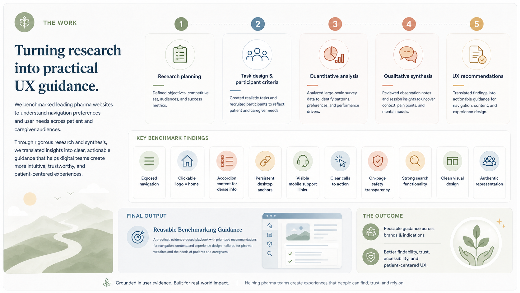
The project included research planning, task design, participant criteria definition, quantitative analysis, qualitative synthesis, and the translation of findings into practical UX recommendations for pharmaceutical digital teams. Key findings showed that users strongly prefer exposed navigation, clickable logos, and navigation as a reliable “home” escape hatches, accordion-style content for dense information, persistent desktop anchors, visible mobile support links, clear and specific calls to action, on-page safety transparency, strong search functionality, clean visual design, and authentic representation. The final output provided reusable benchmarking guidance to help teams design more intuitive, trustworthy, accessible, and patient-centered pharma website experiences across brands and indications.